Case Study: Elevating User Experience for Jefit's Website
The Nielsen Norman Group defines User Experience (UX) as encompassing all aspects of the end-user's interaction with a company, its services, and its products. This case study delves into my involvement in evaluating and improving the User Experience of Jefit's website (https://www.jefit.com/), driven by negative user feedback. The study employs various user research techniques to analyze the site's design, functionality, information architecture, and content.
About the Jefit UX Report
Methods Used for Evaluation
A comprehensive range of evaluation methods was employed, including Competitive Analysis, User Interviews, Surveys, Persona & Scenario generation, Card Sorting, Value Proposition Generation, Concept Model development, and Usability Testing.
Analysis
The research data highlighted significant issues with the current Jefit website, particularly in the top and side menus, Routine Workout Builder, and Exercise Builder. The Competitive Analysis showed that Jefit offers a broader set of features compared to competitors but suffers from a cluttered interface, numerous ads, and unclear navigation paths.
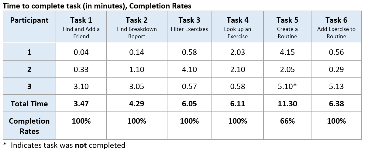
Usability Testing uncovered common challenges among participants, such as confusion in building workout routines, lack of visual cues for progress tracking, and insufficient backward navigation options. The excessive ads also contributed to a cluttered and unclear user experience.
Based on the comprehensive analysis, several key recommendations were developed to enhance the User Experience of the Jefit website:
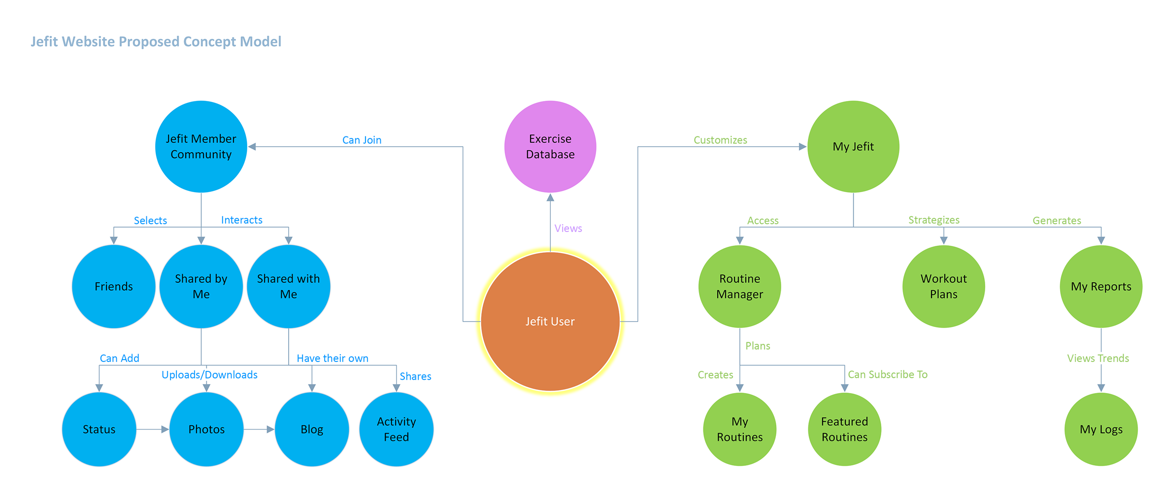
- • Information Architecture Restructuring: Reorganize the site's features to align with the users' mental model, focusing on Jefit Member Community, My Jefit, Workout Plans, and My Reports.
- • Menu Consolidation: Merge the side and top menus for simplified navigation.
- • Routine Redesign: Enhance the Routine feature by integrating frequency and day selection, along with implementing a calendar view.
- • Exercise Setup Improvement: Redesign the Exercise setup for improved intuitiveness and efficiency.
- • Ad Reduction: Reduce the number of ads and optimize their layout to declutter and enhance website clarity.
- • Additional Features: Incorporate valuable features like meal planning, nutrition recommendations, calculators, exercise videos, and live classes.
- • Social Integration: Improve social features for easier user connections, challenges, and content sharing among friends.
Personas
The study generated personas representing various user groups, differentiating by fitness skill level, age, goals, challenges, and technology familiarity. Scenarios and use cases helped understand user interactions.
Card Sorting
Card sorting activities aimed to improve the information architecture. The analysis, particularly using the Similarity Matrix, guided the development of a new menu structure.
User Testing Analysis by Task
Usability testing provided insights into user interactions. Task completion times were charted and assessed to identify pain points.

Concept Model
The Concept Model illustrated how users interact with the website based on the card sorting activity's results, including dendrogram analysis, similarity matrix, and user interviews.

This case study outlines the efforts to enhance the User Experience of Jefit's website. By conducting thorough research and analysis, the recommendations provided aim to address the current issues and align the website with user expectations. Implementing these recommendations will not only improve user satisfaction but also support Jefit's business and marketing objectives. It reflects a commitment to creating a more userfriendly platform for fitness enthusiasts at all levels.


